BLOG
BI | Power BI and Qlik -BI | Some interesting changes at Qlik and what to look for in a business intelligence solution
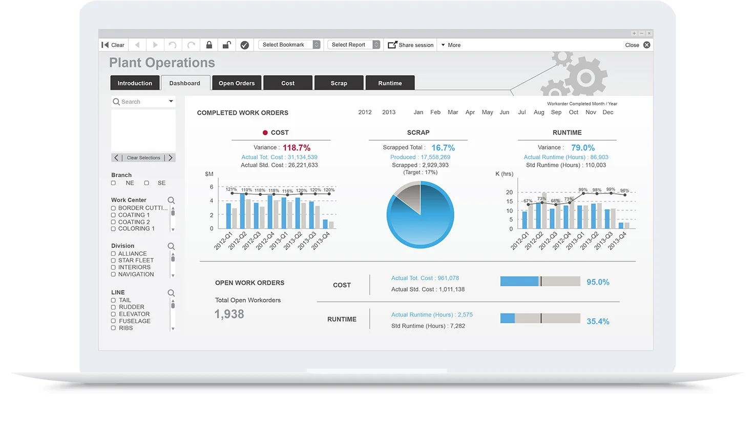
At Advance, we work with tools like Qlik and Microsoft Power BI when delivering business intelligence solutions to provide actionable insights for our clients.
At Advance, we work with tools like Qlik and Microsoft Power BI when delivering business intelligence solutions to provide actionable insights for our clients. Both tools are market leaders and each vendor has a slightly different approach in delivering new insights. We wanted to take a look at some recent changes in Qlik’s licencing model that enables a more complete BI solution and our view on areas to consider when looking at BI tools.
Want to know more about BI and some outcomes we have delivered? We are passionate BI experts. Get in touch here.
Why would you want a BI solution?
BI offers new actionable insights into your business and will empower employees, deliver automated, efficient reporting and analytical dashboards. BI offers insights to provide new and improved:
Revenue streams
Customer experiences
Business processes
Competitive insights
Business performance
Collaboration
Unexpected benefits along the way
When looking at a BI solution it is important to take a holistic view of what you are trying to achieve and the key ingredients in the solution. Here are some important considerations:
Guided analytics and distributed reporting or self-service analytics.
Is a mobile solution required?
Existing applications and business systems.
User skill levels / Experienced developers, business users or both.
Security.
Data / Access / Quality / Volume.
Time to value.
Maintenance - BI solutions often require ongoing development and support.
Cost.
Cost needs to be looked at closely, and we mean the total cost of the software, consulting services and training to get a result. It is important to consider ongoing maintenance of the system. It is common for management to ask for further information, new reports, calculations, different formatting and inputs from additional systems.
One BI tool may offer better performance but if it is 10x the cost of its rival and the implementation and support costs are much higher, it will be a difficult business case to justify, unless there is some critical feature like security for regulatory compliance that is a non negotiable requirement. Qlik is very strong in security, backed up by its use in the finance industry by clients like Westpac and ANZ.
Qlik is a market leader in BI, with close to 50 000 customers globally. Let’s take a look at Qlik’s recent announcement about dual-use licencing and a short history of their BI tools.
Dual-use licensing means you can get Qlik’s modern platform – Qlik Sense: Simple, intuitive and visually brilliant and the original – QlikView: Versatile, complex and powerful. This is an interesting offer for existing users and anyone looking at implementing a BI platform.
Dual-use licencing allows companies to unlock both QlikView and Qlik Sense with a single license key.
The cost is a 30% uplift in annual Qlik maintenance. (*Qlik press release)
This is good news for existing Qlik customers offering access to both products at an additional cost.
Dual-use licensing offers customers a more complete BI offering for both guided and self-service analytics.
Qlik: Our Experience.
We compared many BI platforms when looking at better insights into our own managed services and consulting business as well as offering the service to our clients. Tableau was seriously analysed and considered, and very compelling with a lower cost to get started and great design. After many comparisons, we found Qlik was a better fit for us, more powerful and its ETL (extract transform load) capability was simply better. Tableau is a great tool with some of the best visualisations available. With Qlik, you can pull data from many different sources without the need for a costly data warehouse. Here at Advance, Qlik is one of the main tools we use when developing BI solutions internally and for our clients, Power BI is another key tool with its strengths and a high adoption in the BI arena.
Qlik really is one of the most powerful tools available and difficult to beat when comparing its ability to handle large data volumes and transforming data (matching records, merging sources, preparing for analysis.) QlikView is a genuine enterprise level BI tool.
Our experience with QlikView:
Ease in connecting to virtually any data source.
We are technical developers - QlikView is very powerful in its ability to manipulate or transform the data structure by using script statements and expressions in the Qlik load script.
Speed in building and delivering powerful insights right away. Even in product demonstrations we were able to connect to the data and build dashboards instantly.
Time to value can be as low as a few days.
Limited mobile experience with QlikView - We eventually built our own in house application to give us a better mobile experience and additional capability like distributed reporting and Excel integration through KPI Pulse.
A Short History Of QlikView And Qlik Sense. Why Two Products?
QlikView
Qlik Sense
QlikView has been the flagship product from its founding in the early 1990s through to around 2014, when they introduced Qlik Sense. Since the launch, Qlik has arguably spent more of its development resources on Qlik Sense, a mobile responsive and more visually appealing BI tool. With that said, the 30 000+ QlikView user community has ensured Qlik release new versions of QlikView annually. Some speculate the move towards Qlik Sense might be to better compete with modern and visual data exploration platforms like Tableau.
From our experience, QlikView developers like us find it easier to get results straight away using QlikView when compared to Power BI and Qlik Sense. Important insights with drill down capability right away. QlikView may not look as visually appealing out of the box as Qlik Sense, but more experienced developers can get complex answers quickly, then make them more presentable for public consumption.
Users coming from a programming or data science background are more likely to find QlikView more flexible and powerful. In contrast, for brilliant looking visualisations and self-service analytics - Qlik Sense shines in this area and the mobile experience is responsive meaning that the platform automatically resizes objects. This is important when working across different platforms like mobile phones and tablets, all with different versions of operating systems. Qlik Sense wins here in delivering a modern mobile experience.
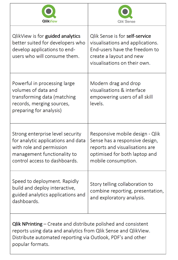
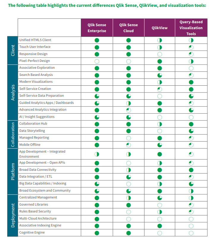
Key Differences And Strengths Of Each Product.
Final Thoughts
Qlik offers a leading BI solution and dual-use licensing is a good thing. It highlights that they want to offer more value in this competitive space and they need to. Power BI offers a comparatively low entry cost and provides a very good BI platform. You can read some of the reasons why we have seen a big spike in demand for Power BI here. Is Qlik the right solution for you? It is a powerful tool but definitely not the lowest cost option.
A thorough analysis of the project needs to be undertaken. Experienced BI experts can provide advice on which tool is a good fit based on outcome required with budgets and total cost in mind. This will help you make an informed decision on the right platform for your business.
Qlik’s new licencing offering is an interesting proposition for anyone looking at a implementing a BI platform. Current users of QlikView can continue developing and supporting existing deployments and try newer features in Qlik Sense for a lower cost than purchasing two seperate tools. This move will also grow interest and additional enquiries for Qlik.
If you are an existing user of Qlik or someone looking to tackle a new BI project, it is a great time to take a serious look at Qlik. There a many great BI platforms out there, Tableau and Power BI are also leading offerings and each has its strengths that really need to be considered and aligned to your business and what you are trying to achieve.
Want To Know More?
You can reach us here or email sales@advance.on.net directly with any queries. BI is our passion and expertise.
We’ve included links to additional content and useful comparison in the Qlik datasheet below.
Additional Insights
Below is a great 5 minute video about Qlik’s April 2019 updates.
Qlik Sense and QlikView Data Sheet PDF
Many Thanks,
John-Paul Della-Putta
Director
Phone: +61 8 8238 6500
Email: jp@advance.net.au
LinkedIn: www.linkedin.com/in/johnpaul
Website: www.advance.net.au
Did you know colour can alter your thoughts and affect team performance?
Colour has a big impact on how you get and stay focused. Discover what colours increase productivity and what your best choices are.
That is why colour is the biggest business you’ve never heard of.
Companies dump millions every year into picking the ‘right’ colour for their brand that often results in positive gains.
It’s in your face everyday; Facebook has their iconic blue, Google has their distinctive rainbow palette. McDonalds has their golden yellow arches, the colour code is RGB: (255,199,44) by the way.
Our marketing manager bought a Google Pixel 3 this week and is moving away from his trusty Iphone.
Apple’s approach is to use an aggressive green to deliberately highlight non Apple devices. In contrast they use and a soft, eye friendly blue for iMessages. This is no accident. The new Google Pixel 3 is a pretty innovative device by the way.
Successful companies embrace memorable colours. Colour cultivates emotional engagement and increases productivity by exciting synapse in the frontal lobe. This human trait dates back to our ape origins. Ripe fruit is a more appealing colour than rotting fruit, wouldn’t you say?
In short-colour affects your brain.
That’s why it’s important to pick the right colour scheme for your dashboard.
The be a colour choosing beast, you need to know what colours make your more productive, how to use colour, and how many colours to chose.
To boost your chances for scoring the best colour scheme for your dashboard, we are going to outline 3-key factors to contemplate when mastering your colour selection.
1: The 3-colour tones and how they impact your mind
2: How many colours is too many colours
3: What colours decrease productivity
The 3-Colour Tones And How They Affect Our Minds
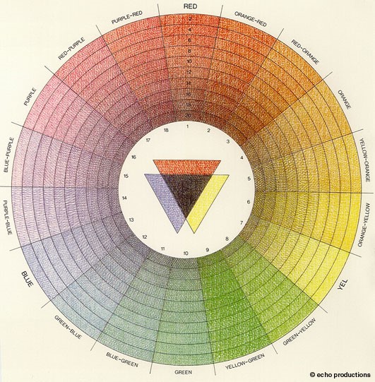
There are basic colour tones.
Each colour tone has a specific impact on our mind. To figure out what colours make you more productive, you need to understand what each tone means.
Here are the three tones:
1: Warm - These are reds, oranges, and similar shades.
2: Cool - These are blue, purple, etc.
3: Neutral - These are black, white, tan, brown, and grey.
When choosing a colour tone, optimise the utility of colour by choosing tone that has a clearing and calming effect.
Some colours distract the mind by being linked to other less productive emotions.
That’s why red is great for advertising but bad for educating or focusing.
Neutral colours get the Oscar for best supporting role and are best for accenting main colours. Neutral colours call to mind documents, writing, and similar static elements.
This is why the neutral colours in social media are text.
Cool colours are meditative in nature and are for projecting calm and clarity. Most integrative brands create a seamless experience for customers with blues, purples, and similar shades.
The tone that elicits any response is good, but the right tone will get what you want from your users. Mastering the type is only the beginning, you must now learn to pick the right number of colours.
2: How Many Colours is too Many Colours
Out of the millions of colours, you want to use the ‘less is more’ method.
The rule of thumb for colour branding experts is to use no more than two colours.
One can be just as powerful as two (for all you single people out there).
There is a Goldilocks zone where colours make you more productive, too many colours and it’s distracting too few and people are waiting for the page to load. Simplicity is the ultimate sophistication, draw attention with passionate order rather than disturb a user with a rainbow of chaos.
When adopting two colours, make sure to harness colours that provoke left-brain cerebral prowess. Here’s what to avoid.
3: What colours decrease productivity
To grow happy productive brain activity, it’s wise to be knowledgeable of ADD and depressive colours that are going to be a distraction (Squirrel!).
Here is our list of three ADD and downer colours to consider avoiding for your dashboard.
1: Orange is a bright colour demands attention. Hunters, and construction guys use it all day every day. That’s why sales pages and opt-in buttons are orange. Capture focus, not distract from it.
2: Grey is a bland neutral colour good for highlighting another, like image boarders. Grey induces feelings of sadness and depression especially in women.
3: Yellow is a great colour with a lot of positive emotions attached to it. With that said, yellow often catches the light in an odd way. Even worse, mobile resolutions are different screen to screen. What looks great in the office under your lights will catch the light differently outside.
So what colours make the human mind most productive?
Simple. Calming ones that don’t distract.
Three takeaways:
A COLOUR SCHEME IS MEANT TO SIGNAL, NOT DISTRACT. RED IS USED IN ALARMS BECAUSE IT DISTRACTS YOU FROM WHAT YOU ARE DOING.
COLOURS ARE FOR YOUR TEAM, NOT BRANDING. KNOW THESE COLOURS ARE THERE TO GUIDE THE USER’S MIND INTO WORKING BLISS.
INCREASE PRODUCTIVITY BY MINIMISING CHOICES. WE ALL GET CHOICE FATIGUE. THE MORE YOU HAVE GOING ON, THE MORE DISTRACTING IT WILL BE.
Final Comments:
Let me know your thoughts on colours, there are times existing branding and colour scheme peer pressure designers into selecting a colour scheme. If you are anything like me, you’ve spend hours making sure you are happy with how a report or metric is presented.
Next blog I’ll dive into: Desktop Widgets and how they can improve efficiency


